Behind the Scenes with Google: Redesigning for Mobile Optimization
by Chris Feltham, Jason Mayes and Cesar Rodriguez
After two and a half years uploading hundreds of educational resources and thousands of creative examples, we recognized the need to redesign the Rich Media Gallery, a website for the ad industry that inspires creative innovation and helps agencies produce engaging digital ads. In the process, we learned a lot about building for mobile, simplifying our navigation, and executing a sleek interface. In this article, we share our goals, best practices, and specific examples from our redesign experience. We hope that by sharing our approach with you, we can enhance your mobile optimization efforts and help make your next redesign an efficient one.
Goals for the new website: Inspire, inform, and engage across screens
We approached the Rich Media Gallery redesign with an interest in simplicity, user-friendliness, and consistency. We set a goal to inspire and inform visitors with a site that's engaging to use and accessible from any screen. We wanted the site to be an entry point to getting started with display advertising at Google and a showcase of the best digital advertising examples.
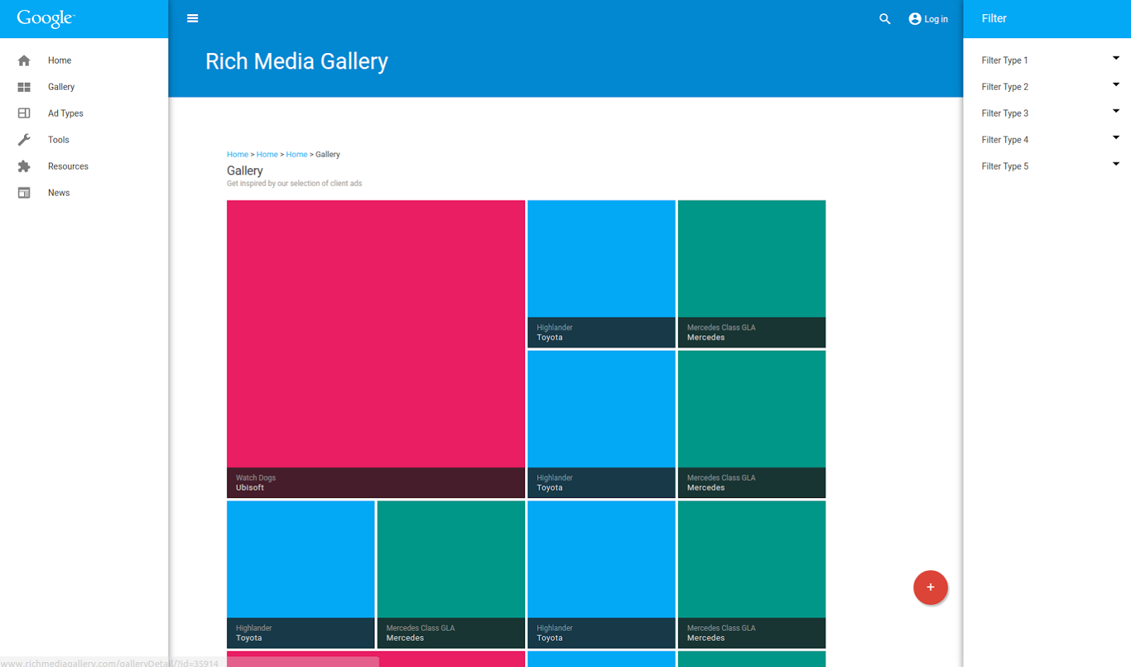
The Rich Media Gallery started as a site for inspiring ad examples, but over the years it evolved into the primary destination for all rich media resources across Google. To meet users’ needs, we had added hundreds of pages of educational content, but we suspected that the new content was making it hard for users to find what they came for. In fact, a visitor survey showed that while 70% of visitors were satisfied with the site, 30% couldn’t find the information they were looking for or couldn't understand it due to acronyms and jargon. This feedback helped guide our redesign and gave us a benchmark from which to compare the next iteration of the site.
The bottomline: Five learnings for redesigning across screens
As we set out to build a redesigned, mobile-optimized website, we learned that you can save time and improve satisfaction with your site by planning for consistency across screens. Here are five best practices for building cross-screen compatible content:
-
- Design with flexibility in mind so that components can be easily reused for use cases that you have yet to dream up. This will save you time in the future and can help others out, too.
-
- Avoid introducing different user interface elements on desktop that aren't available on mobile (or vice-versa). For example, there is no such thing as “hover” on a mobile device. If your design relies on this to work, you have just created more work for yourself.
-
- Think about mobile first. It is not as simple as “resizing your desktop ads to look pretty on mobile." In many cases, the way that people interact with a mobile device is very different from how they interact with a desktop. Consider, for example, how many smartphone users will hold their device in just one hand. Look for ways to make an person’s life easier if they are navigating your mobile site this way.
-
- Think about mobile device orientations early. The aspect ratio on devices can significantly vary from portrait to landscape modes. Therefore, it's important to think about the way that your assets, such as images, videos, or text, will behave in both modes.
-
- Consider content safe areas, since mobile devices have multiple screen sizes and pixel densities. Identifying a common denominator will go a long way when creating your design.
Material Design: The right approach for an efficient redesign
At the outset of the project, we knew we needed to have an efficient approach, so we decided to start with material design. Material design is a comprehensive guide by Google for visual, motion, and interaction design across platforms and devices. The intro video below explains the basics if you’re new to material design.

Material design made our multi-screen project faster and easier in a number of ways:
-
- It provided us with a color palette to work with and visual guides for key parts of the site, such as inputs, buttons, and grids.
-
- Its big, bold imagery helped us reduce visual clutter and showcase rich media creatives in a high-impact way.
-
- Its components let us organize large amounts of content and present it in a clean, simple manner.
-
- Its framework allowed for a better site architecture that gave us more room for experimentation. This helped us reduce the Rich Media Gallery to its bare essentials.
-
- It got us thinking about motion design with these example animations, which we replicated and built upon.
Examples from our redesign: Motion design, responsive transitions, and reusable custom elements
Example #1: Motion design
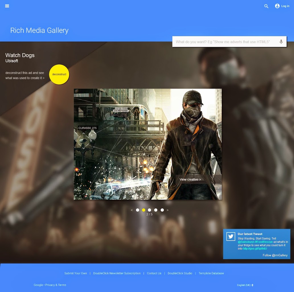
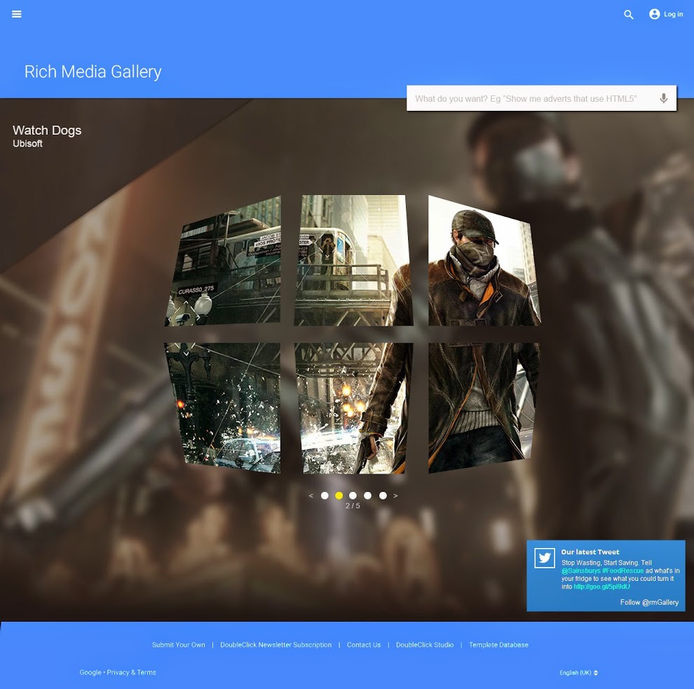
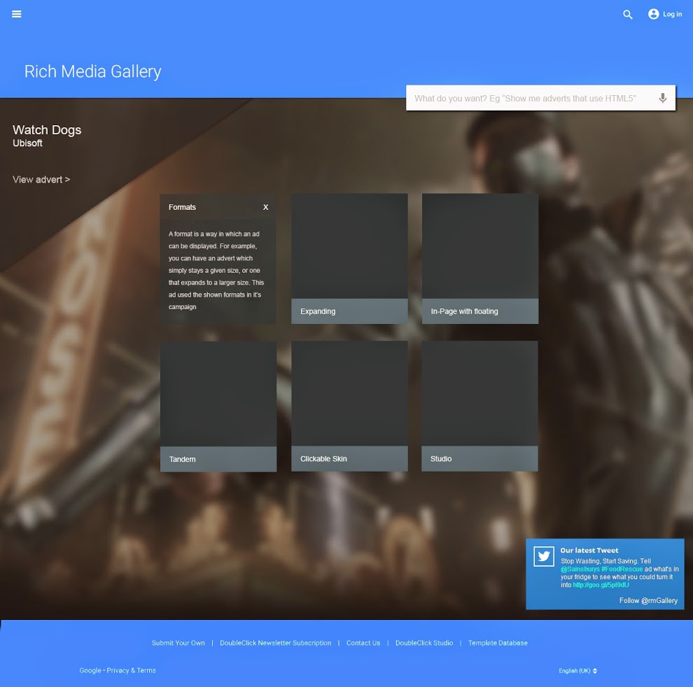
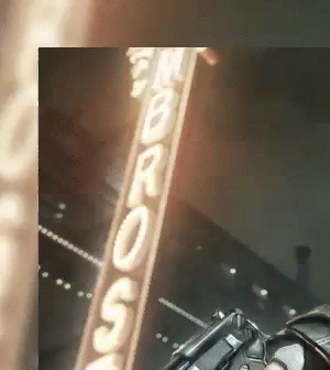
We applied material design guidelines to a new “deconstruct” feature for ad examples on the homepage, which provides more detailed information for each creative example in a playful manner. When a visitor engages with the button, the ad example breaks fluidly into six pieces, which flip over to reveal details about the creative - from formats and features, to the people behind its creation.
Step 1: Visitor clicks the yellow "deconstruct" button
Step 2: The featured ad example fluidly breaks into six pieces
Step 3: The pieces flip over to reveal all the details about the ad
Example #2: Responsive transitions
There are many forms of design, yet our previous site and initial design cycles only addressed interface and graphic design principles. By applying material design to a blank canvas, we were able to improve the site's user experience, motion, and interaction design. We've learned that the transitional states between actions performed in a web application can change the whole feel of the site. Transitions should be beautiful, explanatory, and delightful.
For example, we built a transition between wide and narrow browser widths using the NodeList component. We programmed it as a custom element capable of positioning and resizing any HTML element grouping you pass to it, even if they have different aspect ratios. This creates a highly responsive transition that minimizes the presence of white space. As the browser width changes, HTML element groupings flow, instead of snap, into their new positions. This transition provides a more natural way for users to engage with the site.
A responsive transition example
Example #3: Reusable custom elements
In this redesign, we quickly realized that our work should be able to be repurposed by other teams for other projects. This realization really hit home when one of us (Jason) had been working on a personal project to solve a problem with positioning content. He learned that it was a common problem, which many people were trying to solve. Instead of solving the positioning problem for just himself, Jason converted his solution into a custom element that would play nice for others. This experience inspired us to create reusable custom elements, wherever possible, that use clean HTML markup such as this:
<ci-rmg-nodelist id="myNodeList" unitsize="240" margin="4" delay="30"></ci-rmg-nodelist>
<ci-rmg-filter for="myNodeList" type="gallery" api="api"></ci-rmg-filter>
<ci-rmg-readapi id="api" server="/"></ci-rmg-readapi>
These elements can help less technical people put together a complex front-end in minutes simply by configuring the attributes of a few HTML elements. For example, the three custom elements in the above code snippet work together to produce a fully functioning interface.
A fully functioning interface produced with reusable custom elements
These elements make customization easy. For instance, we could throw away the current API element and implement a new element that spoke to, say, Google Plus instead. Then, the content pulled into the interface would be Google Plus posts instead of Rich Media Gallery features. This means our work can be reused by others and is not tied exclusively to the Rich Media Gallery.
Working with external projects
We knew early on that the Rich Media Gallery needed to work gracefully in older browsers. This requirement prevented us from simply using Polymer (a framework and library that makes it easy to implement material design.) As we worked through the kinks to ensure our website would be compatible with older browsers, we rewrote components in Web Starter Kit, so that our solutions can be used by others to make their material design projects work on older browsers as well.
We also pushed the limits of 3D transformations by finding and documenting a workaround to an obscure bug with a property called rotate3d. In Chrome, the rotate3d property can be used to rotate a rectangle by 90 degrees while also rotating it about its diagonal. However, in Firefox the rotate3d property produces an unacceptable "snapping" of text at the end of the rotation. Our solution was to use two transforms, matrix3d() and 2dmatrix(), to accomplish the same thing. Our documentation around this solution has already helped other web developers facing similar difficulties.
3D transformation: In Chrome, rotate3d works as expected
3D transformation: There's a bug in Firefox, where rotate3d produces an unacceptable "snapping" of text

Jason also wrote and published a presentation about custom elements. It provides a short introduction to Web Components by covering examples, browser support, writing your first component in Polymer, and resources for further reading.
The keys to our redesign
Keeping mobile optimization best practices in mind, using material design, and developing for reuse were the keys to our redesign of the Rich Media Gallery. We hope by sharing our experience, we can enhance your mobile optimization efforts and help to make your next redesign an efficient one. You can check out the outcome of our redesign at www.richmediagallery.com.